The New Petersen Automotive Museum
Location
Los Angeles, CA
Owner
The Petersen Automotive Museum
Design Architect
Kohn Pedersen Fox Associates
Architect
House & Robertson Architects
Construction Manager / Owner's Rep
Walker Real Estate Services, LLC
ViewThe Petersen Re-Emerges
In spite of the Petersen’s amazing location smack-dab in the middle of Southern California – the car-culture capital of the world – before 2016, the most visitors the Petersen had received in a single year was 138,000. Now with a finely tuned re-vision and a new racing team, the landmark museum is ready to set new records.
As the museum approached its 20th anniversary, Petersen supporters began working with New York-based design firm, Kohn Pedersen Fox, on concepts for a striking new exterior, one befitting an institution founded by Hot Rod Magazine’s patriarch, Rob Petersen.
Swept up by the momentum and inspiration behind the project, the board determined that even with looks pretty enough to stop traffic, they needed more to draw visitors in for a closer look. And they needed something – the sort of propulsion that movie producers call “legs” – to bring people back again and again. Only that would open the eyes of the local populace to the treasure that was under the hood of this amazing institution, and drive attendance records to the levels the Petersen deserved.
And so with car enthusiast Tim Walker of Walker Real Estate Services LLC as their owner’s rep, the Petersen’s management and board went looking for the best team they could assemble to design, engineer and execute a massive renovation to their museum, inside and out. What they got was what one admirer called “a veritable who’s who of A-listers.”
The Petersen started with securing KPF as the design architect for their new exterior. For project leadership, they tapped House & Robertson as executive architect and MATT Construction as general contractor, tasking them with executing the massive renovations to the existing building’s infrastructure and interiors, as well as a major exterior renovation, including selective demolition, façade installation, porte-cochere and parking structure enhancements, all new sitework and a complete remodel of the 4th floor rooftop event space.
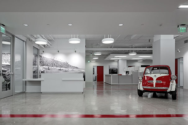
They began by moving the museum’s administrative staff out of their third floor offices to clear interior space top-side for more galleries. Working with Clara Igonda Interior Design, H&R and MATT efficiently transformed approximately 29,000 sf of the Petersen’s block-long basement into a stylish new creative office suite, including installing new MEP and a dedicated air handler. They did it in just four months with no interruption to museum operations thanks to thorough planning and strict implementation of safety, dust control and noise suppression measures.
To lead the redesign of the gallery levels, exhibits, content and technology, the team brought in The Scenic Route, a production support firm that conceptualizes, designs, fabricates and installs temporary and permanent sets, exhibits and immersive experiences for varied clients including filmmakers, computer game designers and simulation facilities. The Scenic Route brought in creative agency MindOverEye to create original video content.
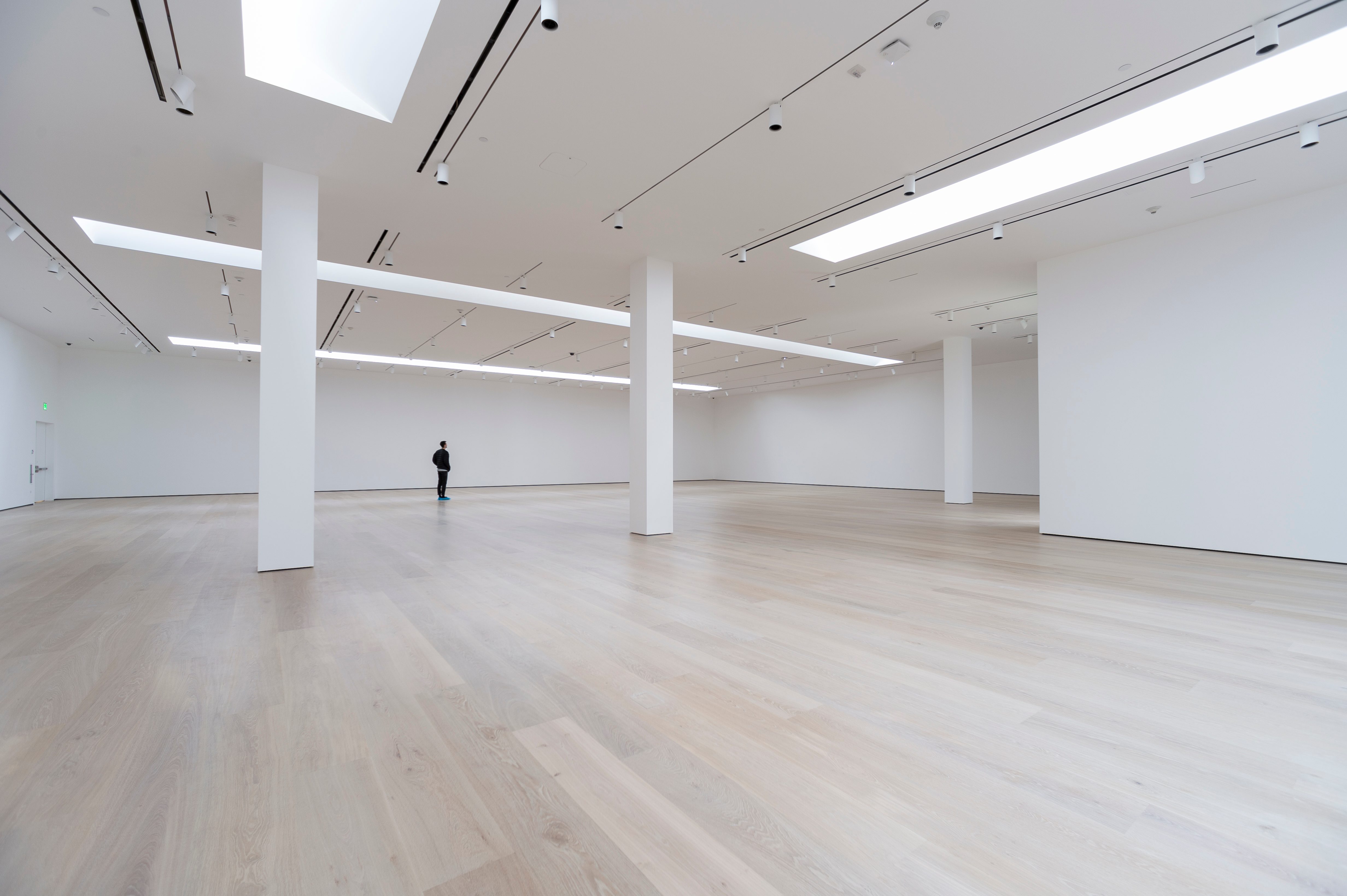
The team completely gutted the interior, replacing the old department store escalator – which had connected only the first and second floors – with an open, generously proportioned staircase that spirals from the ground level to the new third level galleries. The staircase design brings in light and establishes a sense of connection between floors. The spiraling stair opens the museum’s 25 galleries to view, allowing visitors to orient themselves and navigate the exhibits with minimal wayfinding signage. It also gives the museum the opportunity to unfold its stories gradually, revealing a different perspective with each step. A passenger elevator provides an alternative to the stairs, and makes it easy to explore from any starting point.
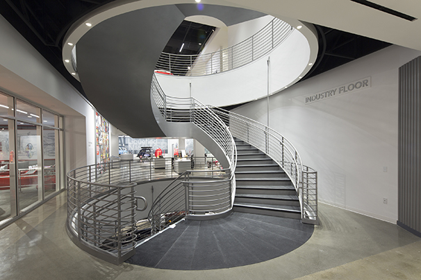
The spiraling stairs
Addressing a notable omission in the old museum, the team also worked to provide a strong physical and visual connection between the street and the museum interior. In addition to creating a façade design, KPF improved sightlines with a concourse running from the upgraded porte-cochere in back of the museum, through a central ground floor lobby, to a pedestrian exit on Wilshire Blvd. Not incidentally, this created a convenient shortcut from the parking garage through the Petersen to Wilshire Boulevard, providing another welcome opportunity to show potential visitors what the museum has to offer.
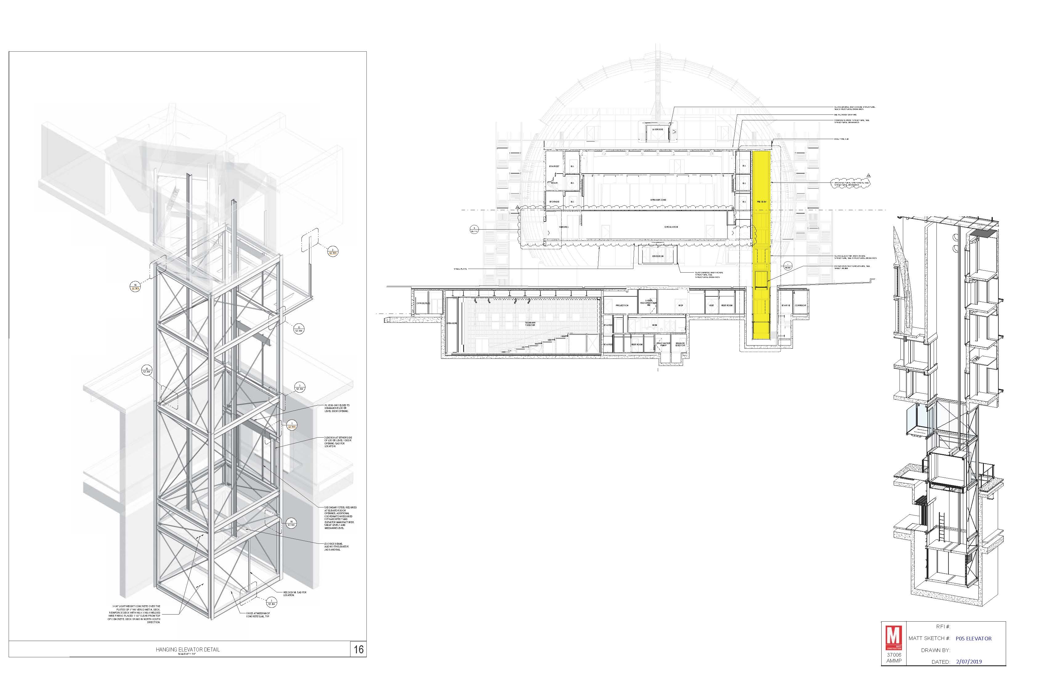
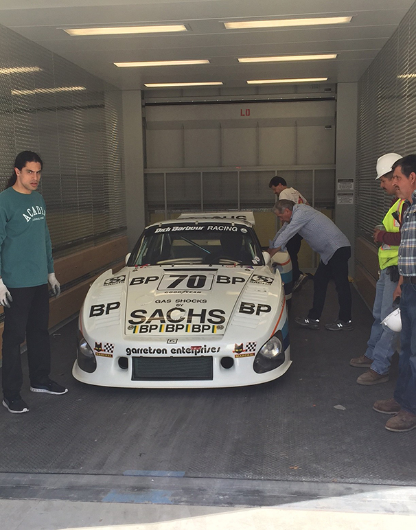
To facilitate the frequent display changes that would attract repeat visits and to serve new galleries on the 3rd level, the team installed an enormous, 14,200 pound-capacity, car-sized elevator. Along with an innovative platform-and-caster system in the exhibit halls, the elevator makes it easy for staff to switch vehicles in and out.
The Petersen wanted to use its collection to tell important stories. Cars, after all, occupy a huge space in human history and consciousness, individual and collective. In addition to the personal and cultural meanings individuals have attached to them, cars have literally driven human history, steered technological development, shaped our terrain and altered the balance of natural resources and our climate. With a peerless collection of automotive artifacts, documents and over 300 artistically and historically significant vehicles, the Petersen has the means to address every one of these aspects, and more.
But … how?
From its experience working with the entertainment and game-design industries, The Scenic Route had gained insight into using content, technology and setting not simply to tell stories, but to get the audience to listen to them. This obvious but often overlooked part of the equation entails attracting initial attention, sustaining interest, cultivating a receptiveness to hearing the message, and then providing engaging opportunities to apply the new knowledge in a way that fosters its retention and stimulates further exploration.
The perpetual problem of reaching diverse ages and educational levels is exacerbated by the current generational divide over traditional and digital media. In order to reach the broadest possible audience, the Petersen team would need to understand and meet the needs of both sides, even while keeping pace with the rapid evolution of related technology.
The Petersen opted to rev things up with a stable of high performance, cutting-edge interactive exhibits, enhanced static displays, augmented reality and immersive learning experiences addressing a wide and changing array of issues. To maximize flexibility, both for what is displayed where, and the constantly evolving technology used to display it, The Scenic Route developed several durable, “future-proofed” systems, including a computer network equipped with preprogrammed functions, a customized content management system, and user-friendly infrastructure and interfaces which museum staff can easily use and readily update for years to come.
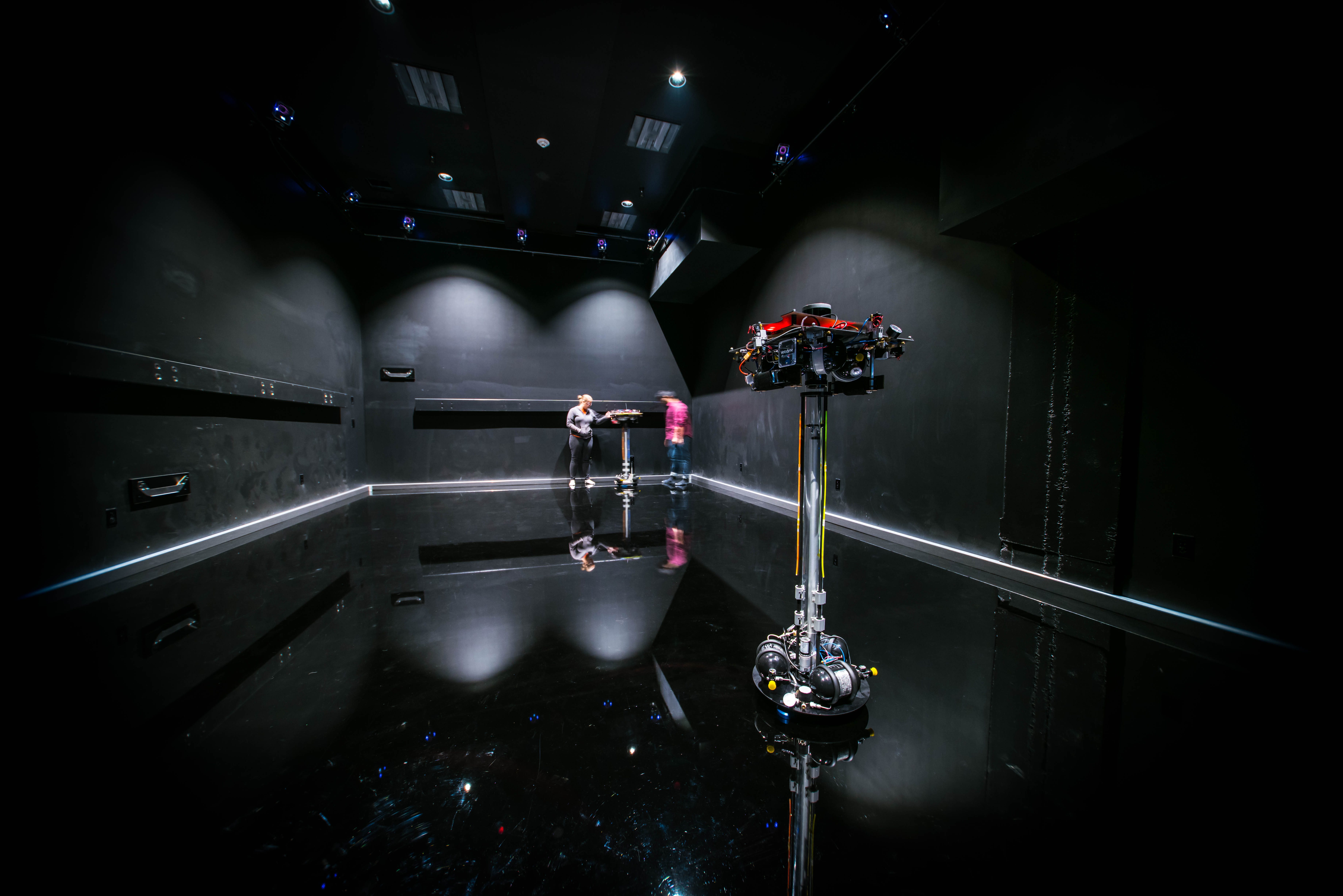
The new Petersen boasts over 160 different screens, including 35 interactive touchscreens, 25 LED monitors, an 8-by-20-foot LED billboard, and multiple large-scale projection walls. Redundantly networked computers stream custom video content, control lighting and synch surround-sound. Less tech-heavy displays include nearly 300 scale models of automobiles and automotive systems. Even the traditional “car-and-card” exhibits are pumped up with touch-displays and innovations like automotive lifts that allow visitors to see the modifications involved in a custom hot-rod car.
A brief tour of the galleries – starting, as the museum recommends, at the top – demonstrates how the new Petersen incorporates all of these changes.
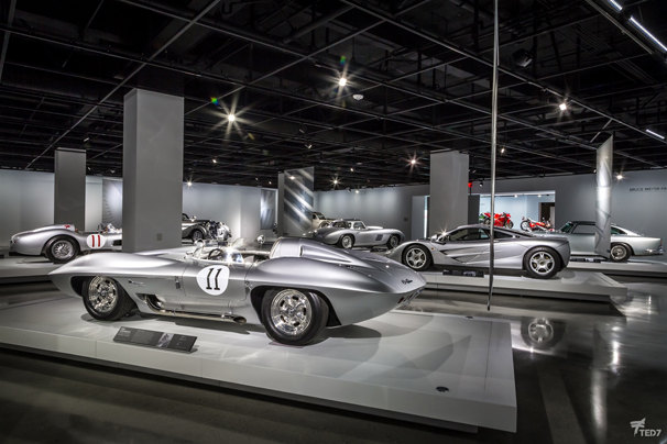
The third floor showcases the history of the automobile: designs, realized and conceptual; modifications to appearance or performance; and how the invention and development of the car shaped the world socially, economically, environmentally and even topographically. MindOverEye’s audio-visual presentation, “The Road to Stardom,” highlights “Hollywood’s Love Affair with the Car,” setting the perfect stage for the Petersen’s popular collection of iconic vehicles from movies and TV.
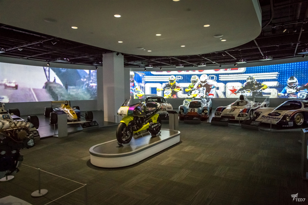
The second floor is dedicated to the automotive industry, from design through production, marketing and finally, end use. With the largest gallery space in the museum, and the most technical subject matter, this floor boasts the highest concentration and diversity of new high-tech exhibit equipment. Highlights include working studios inhabited by graduate students from Art Center College of Design’s transportation design department, the augmented reality Pixar Mechanical Institute, where characters from the popular movie CARS guide visitors through the process of designing a race car. In the Thrill of Motorsports gallery, a 180-degree video played out on a semi-circular screen seven feet high and 134 feet across, immerses viewers in a day in the life of an auto race. A suite of simulators in the Xbox Forza Motorsport Racing Experience puts drivers behind the wheel to compete against virtual pros on famous international tracks. After experiencing the adrenaline rush of speeds up to 245 mph, visitors have an entirely new appreciation of the classic cars on static display, several of which actually raced on those fabled courses.
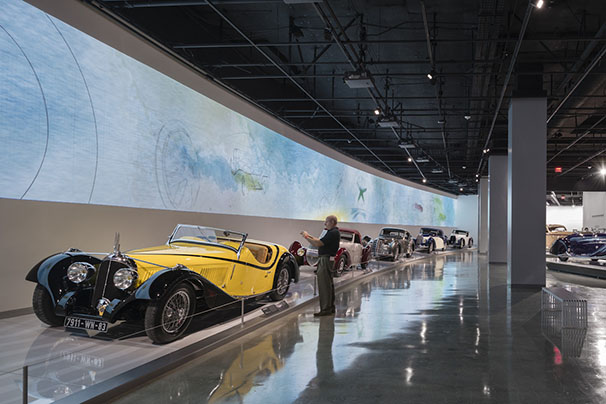
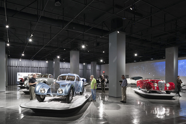
The first floor focuses on automobiles as works of fine art. The ethereal music and abstract imagery of MindOverEye’s 12-minute video, “Spark of Inspiration,” which plays out on a 16-foot tall, 166-foot wide arced wall, provides an emotional backdrop for the sleek sculptural forms – bespoke Bugattis and other rare Art Deco beauties – that exemplify automotive artistry at its most elegant. A separate gallery highlights other artistic representations such as the BMW Art Car series. The first floor is also where visitors will find the museum shop and (eventually) a restaurant.
The vault, located in the original department store’s block-long basement, is where 150 or so vehicles – more than half of the museum’s collection at any given time – await what may now be an accelerated chance to star in rotating exhibits. In the meanwhile, these vehicles can be viewed in guided tours by appointment. Up above, the rooftop has been spruced up to offer more attractive special event facilities.
Structural engineers Saiful Bouquet incorporated seismic upgrades and strengthened building and upright pile foundations to support the large localized forces that the museum’s new façade – an estimated 135 tons of steel and aluminum – imposes on the existing concrete structure. To support the swirling metal ribbons that extend up and over the rooftop, the team designed and installed structural steel trees – engineered by Wallace Structural Engineers and fabricated by the A. Zahner Company – that carry the ribbons of the facade over the rooftop event deck.
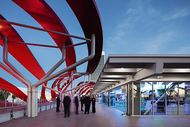
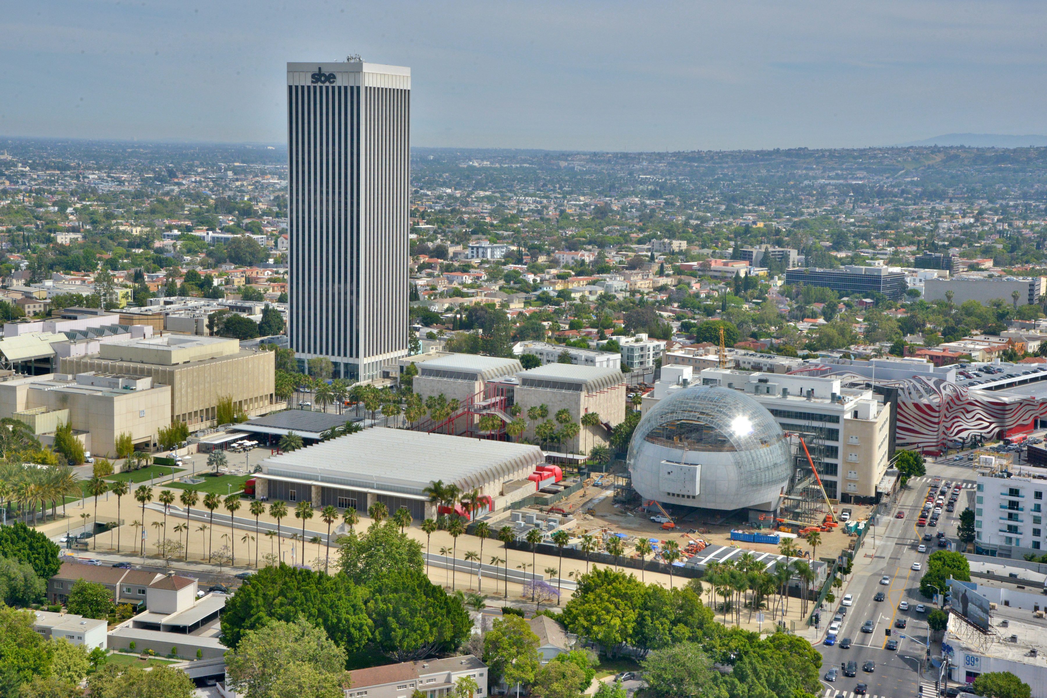
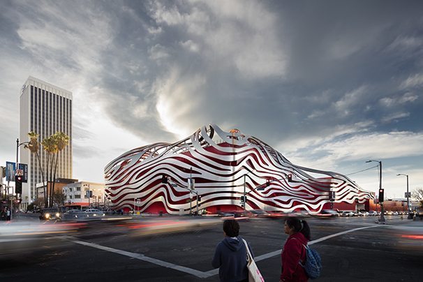
The new façade transforms the building from box to unforgettable cultural icon without making any substantive changes to the footprint of the original Welton Beckett-designed building. (The removal of the old museum’s Jetson-esque vertical fins constituted only a cosmetic change). To help develop and ultimately fabricate and install the façade, KPF and MATT brought in a past collaborator, Kansas City, Missouri-based A. Zahner Company, experts in, as KPF puts it, “creating unorthodox metal structures.” For inspiration, the team used the romance of the road, cherished deep in the heart of southern California car culture: the seductive shape, the throbbing power, the feel of roaring up the PCH on a beautiful day – the top down, the radio blasting, the wind in one’s hair.
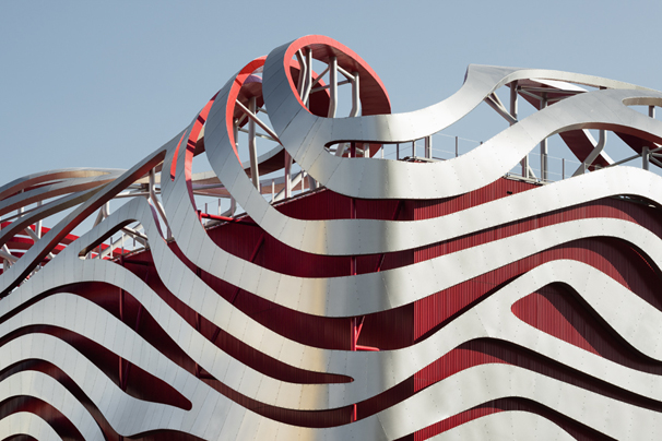
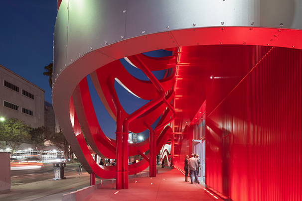
The vision of a race-car-red body and windblown tresses that emerged organically from the group eventually morphed into substance: a red corrugated aluminum wall wrapping around the exterior of the plain building’s stripped-down “chassis,” overlain with a rigid cantilevered body of 308 distinct, interlocking beams which join together seamlessly to create swirling ribbons of brushed stainless steel-clad aluminum, enveloping the red chassis as though lofted by speed and wind.
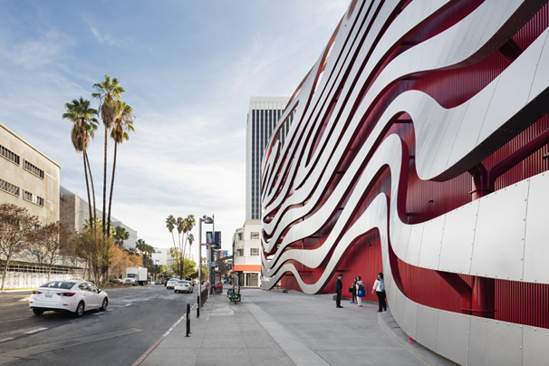
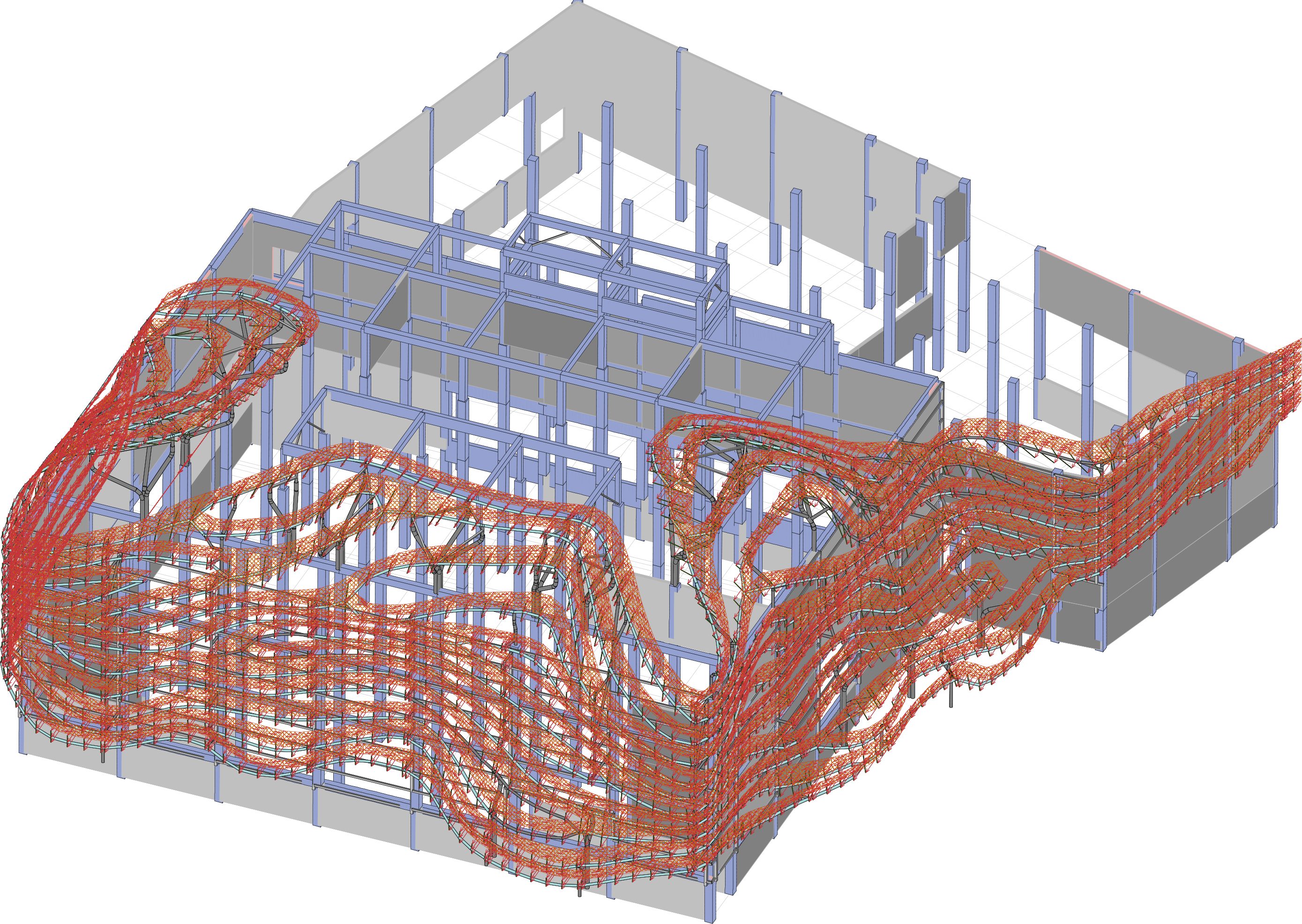
Zahner parsed this complex vision into realizable parts via its patented ZEPPS (Zahner Engineered Panel Profiling System) process, using the architects’ 3D model to digitize every curve, twist, connection and attachment point for each of the 308 one-of-a-kind ribbons.
The red rain screen that serves as backdrop is just as customized. To provide an attractive textured surface, the Zahner team hand-formed panels of corrugated metal uniquely configured with precisely square 90-degree bends.
Zahner developed an internal structure for the ribbons, which utilizes bent aluminum and in some cases steel tubes that tie back to the building structure, creating a spine on which to hang the ZEPPS aluminum framing. The ribbon skins in stainless and aluminum then lock in the aluminum ribs and provide a curving form precisely cut from the model.
Finally, they visually continued the façade motif across the parking structure with a perforated, patented red screen-wall system.
Rigorous virtual and physical mockups allowed the team to resolve any lingering design, manufacturing and installation issues, clarify how the ribbons would wrap around corners, optimize the supporting structural system, and even establish the ideal finish of the ribbons and shade of race-car red.
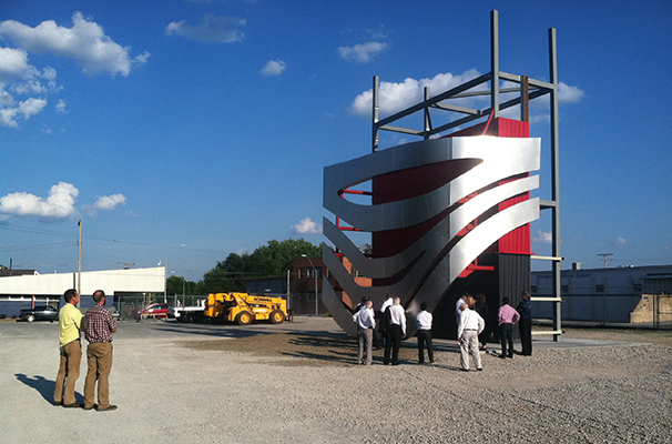
Using these refined models and computational processes, Zahner manufactured and pre-assembled the actual components so precisely that minimal tweaking was required onsite either for the attachments or the ribbons themselves.
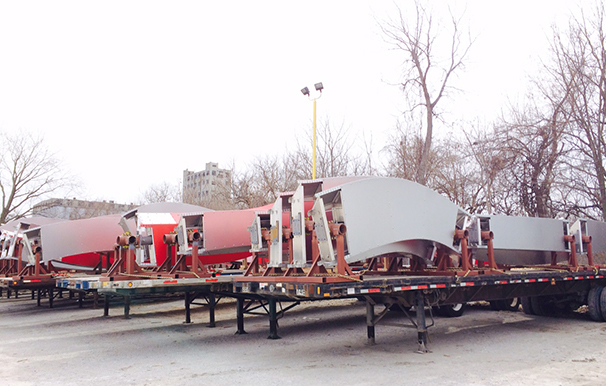
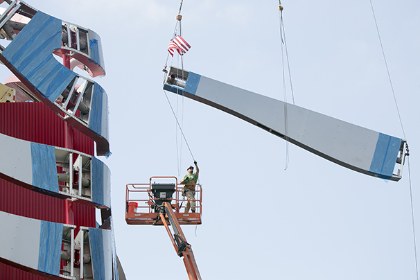
Once the semis laden with the corrugated panels and pre-assembled ribbons began arriving at the Petersen, a team of six Zahner field operators stood ready to install them.
A mobile crane moved the components to a staging area atop the museum’s parking garage, where a giant tower crane, its counter-balanced arm long enough to reach from Fairfax to Orange Grove, picked them up and lowered them into position for installation. The tall tower crane eased the impact of construction on surrounding traffic, but added complexity to the construction itself. The crane’s enormous weight combined with the topographical situation here adjacent to the Tar Pits, where the ground is saturated with naturally seeping asphalt and mined with pockets of gas, combined to require a foundation of 75-foot-deep columns or caissons – a length equivalent to seven stories underground.
Despite these and other challenges, the team brought the new Petersen to the finish line on time and under budget. The finished effect of the architecture is one of speed, motion and joy, as though a carefree moment has been frozen in time and space. Darkness only amplifies the effect when, as cars’ headlights wink on at dusk, LEDs lining the red undersides of the ribbons light up to create a glow that accentuates the sculptural feel.
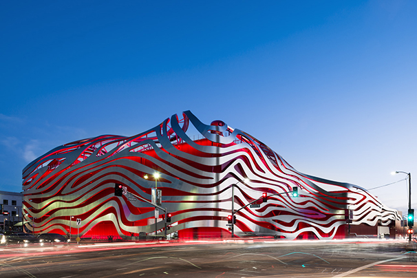
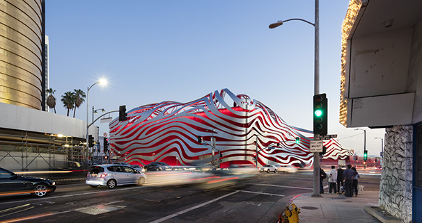
KPF calls it “a contemporary interpretation of the mid-century, space age ‘Googie’ architectural style that characterizes Los Angeles.” Others view this visually arresting new landmark more emotionally, likening its “swirling aluminum and steel” to “a metaphoric manifestation of wind-tunnel slipstreams and meandering roadways.” A KCRW interviewer confessed the view that it “celebrates the car in its extreme sexiness.” But perhaps most charming was the admirer who simply sighed, “Check out those sweet racing stripes.”
“No one can debate that the Petersen now visually owns the corner of Fairfax and Wilshire,” said The Architectural Newspaper. Car collector and former Petersen chairman Bruce Meyer emphatically agrees: “Nobody’s ever going to drive by this building and not know we’re here.”
To the museum’s executive director, Terry Karges, and his colleagues on the board and staff, the creation of the new Petersen has proven to be “one of those rare instances where the reality exceeds the dream or the vision, the design, the model…and that is a rare feat in both the architecture and museum worlds.”
Mr. Karges graciously added, “Thanks to the efforts of Kohn Pedersen Fox, MATT Construction, A. Zahner Company, The Scenic Route and our incredible Petersen team, we have transformed a building that was once an old department store into one of the most groundbreaking structures in Los Angeles.”
MATT Construction thanks the Petersen and the entire team for the opportunity to work on this exciting project, and wishes the museum a smooth road and a fast track to surpassing its goals.
Photos by Raimond Koch, David Zaitz and Nathaniel Riley


